
Best Site Design Tips
There is no ONE way to edit a page since there are unlimited uses for a funnel or website. Walk through our favorite funnel & website design tricks that we use all the time & apply them to your pages.
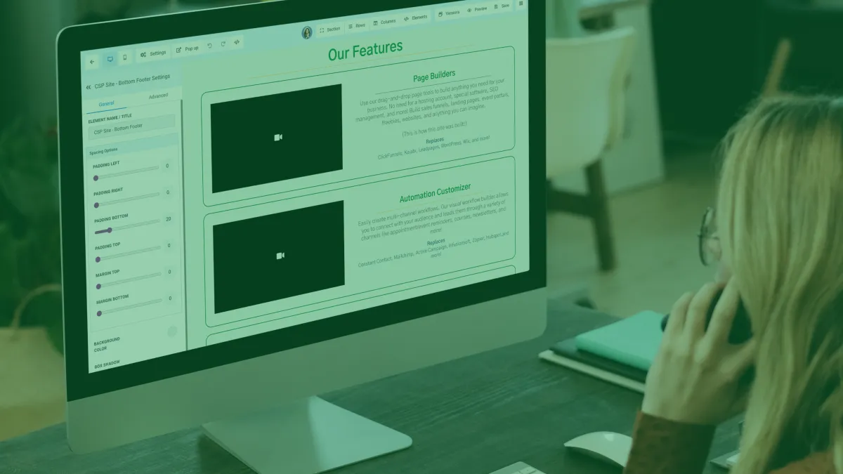
Borders - We use borders to add colored edges to a section, row, column, and almost all elements & buttons We also use these borders to adjust the radius of these edges from straight edges to rounded edges.
Background Image - We use background images to add texture and graphics to our pages. More specifically, we use the Image Options dropdown setting to position the image the way we want it. We also use the background color to add a colored overlay on the image & adjusting the Background Image Opacity setting.
In general, we will utilize the background settings under the page settings - background to add an image for the entire page. Whereas if we only want the image to be the background of a certain section, row, or column, then I would adjust those same settings by adding the image on that level rather than the entire page.
"Design creates culture. Culture shapes values. Values determine the future."
-- Robert L. Peters, designer and author
Margins - We use margins alongside the padding settings to add space outside of the section/row/column/element instead of the inside the way padding does. For margins specifically, we also use negative numbers to overlap boxes & further customize the layout of the page.
Typography - Under the same page settings button where you can add a background image for the whole page, add custom CSS, or edit SEO...you can also set the typography for the whole page & pull in Google fonts when it comes to headlines, content, links, and font color.
Row Width - At the very bottom of your row's settings, you can adjust the width of the row. If you want it even wider, toggle the "ALLOW ROWS TO TAKE ENTIRE WIDTH" bottom setting of the section your row is in.
Visibility - We use the visibility toggles on any section, row, column, or element we want to be viewable on desktop but not mobile, viewable on mobile but not desktop, and more! As well as the top bar toggle to switch between the view while editing This allows you to customize the look of your pages on mobile devices and desktops to ensure the look of your page is transitioning smoothly.
"The alternative to good design is always bad design. There is no such thing as no design."
-- Adam Judge, author
Sticky Top/Bottom - Set your section to stick to the top of the page as you scroll or stick to the bottom of the page as you scroll.
CSS Selector - Use the CSS selector codes under the advanced tab of any section/row/column/ or element to tweak custom CSS coding or jump to a part of your page off of a button or navigation bar.
Icons - We use icons in text box elements with and without text to add different logos, graphics, and icons that are easy to adjust colors, size, and more. These also work on buttons.
Custom Fields - Use custom fields and values on landing pages after a form submission, appointment booked, etc. including fields like {{contact.name}} {{appointment.start_date}} and more.
Custom CSS - Use Custom CSS coding to completely code & customize your page, widgets, and more in the same settings dropdown as typography as well as custom HTML elements. Utilize some templates & builder account funnels to practice.


Innovation
Fresh, creative solutions.

Integrity
Honesty and transparency.

Excellence
Top-notch services.
©️ 2025 Sem Express, a Blue Internet Solutions Ltd. Product.
All Rights Reserved.
PRODUCTS
CUSTOMER CARE

LEGAL
CONTACT US
Blue Internet Solutions Ltd.
128 City Road
London, EC1V 2NX
United Kingdom
Phone: +44 7445 302 423
FOLLOW US